

Nefarious UX is now a thing
If you love somebody, set them free.

I’ve grown uneasy watching user experience design cross a line. What used to be smart persuasion is now turning into outright manipulation. The term for it is nefarious UX. It’s not just bad design. It’s calculated design.
The Federal Trade Commission just proved that. Amazon agreed to pay a major settlement after regulators accused it of making it “knowingly difficult” for users to cancel Prime subscriptions. The case revealed that Amazon’s internal name for its cancel process was the “Iliad Flow.” Yes, the same Iliad that tells a story of a long, painful journey. That was their nickname for the cancellation funnel.
The FTC’s complaint outlined a list of deliberate design choices that made cancellation difficult. The “Cancel” button was buried behind unrelated pages. The wording shifted mid-process. Users had to click through multiple confirmation screens, each one worded to confuse or guilt-trip them into staying.

This wasn’t a glitch. It was intentional. Amazon’s own data showed that the more complicated the flow, the more users gave up before finishing. They treated cancellation as something to optimize against.

That’s the heart of nefarious UX: using good design skills for bad outcomes.
The new frontier of optimization
Conversion rate optimization used to be about improving performance. Now some marketers are using the same tactics, called dark patterns, to slow performance down when it hurts their metrics.
A dark pattern is a user interface design that intentionally tricks, manipulates, or pressures people into taking actions they might not otherwise take.

In other words, it’s when a website or app uses design, wording, or layout choices to benefit the business at the user’s expense.
Common examples include hiding unsubscribe or cancel buttons, pre-checking boxes for paid upgrades, using misleading colours or copy to steer users toward one choice, or creating extra friction when trying to leave a service.
The term was coined in 2010 by UX researcher Harry Brignull, who described dark patterns as “tricks used in websites and apps that make you do things that you didn’t mean to, like buying or signing up for something.”
In short, dark patterns weaponize UX to serve the company’s metrics instead of the user’s intent.
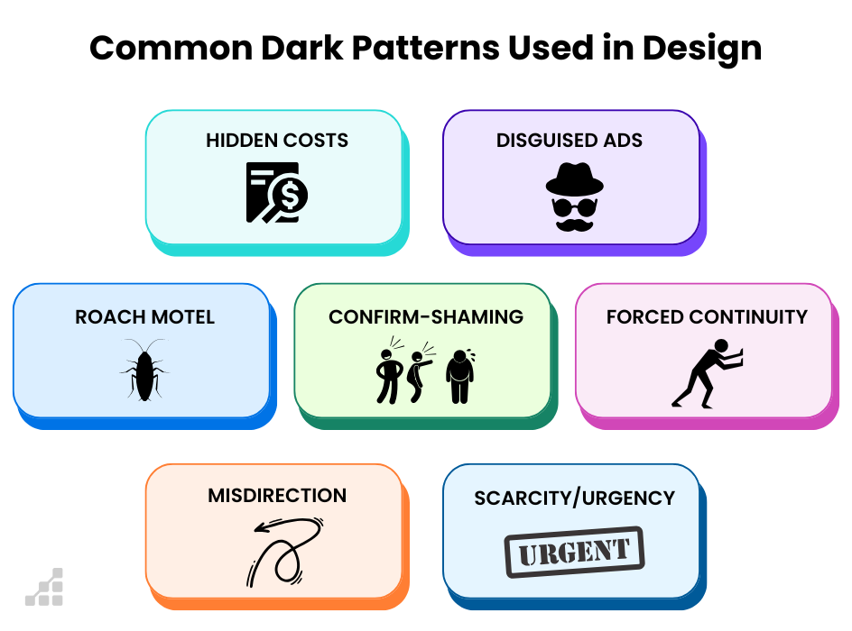
Here are some of the most common:
Roach Motel
It’s easy to get in, but almost impossible to get out. You can sign up with one click, but to cancel you have to go through five steps, log in on a different device, or call customer support.
Confirm Shaming
The cancellation button says something like “No thanks, I hate saving money.” The goal is to make you feel bad for leaving.
Misdirection
The “Cancel” button is small, gray, or placed beside a much larger “Keep Subscription” button. Your eyes are drawn to the wrong action.
Forced Continuity
You sign up for a free trial. The trial ends, and your card gets charged automatically. The cancel button is hidden, or doesn’t appear until you contact support.
Interface Interference
The interface itself fights you. Pop-ups appear, buttons shift position, or entire pages are redesigned to make cancellation confusing.


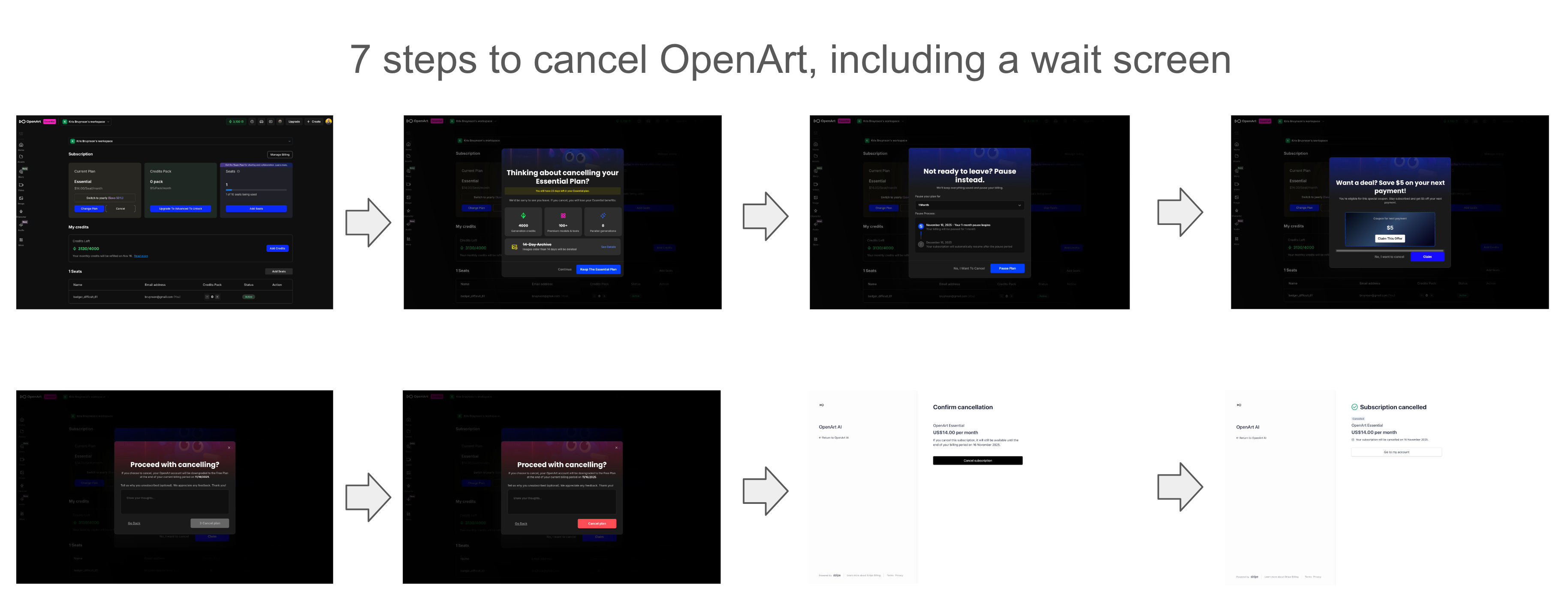
The Amazon case showed all of these patterns at once. Regulators said it wasn’t just poor UX. It was deception through design.
Real examples from other companies
Amazon is far from alone.
HelloFresh has been criticized for hiding its cancel button behind multiple submenus. Users have to click through pages that say “pause your plan” or “skip deliveries” before they find the actual cancel option.
Uber One members report similar issues. The cancel button is hidden under “Account” → “Membership” → “Manage.” After you find it, you still have to confirm on several screens that look nothing like the main app.
DoorDash’s DashPass has been called out for burying its cancellation option in support forms. Some users have reported needing to submit tickets just to stop billing.
A 2023 research paper titled Staying at the Roach Motel analyzed hundreds of online subscription sites. More than half required users to go through multiple pages, forced them to type out “cancel,” or made them call a customer service line.
This is a new business model built on friction.
Why this matters
At first, dark UX tricks were small annoyances. A pop-up here. A pre-checked box there. But when cancellation friction becomes part of your growth model, it’s a trust problem.
When users feel trapped, they lose confidence not only in your product but in your brand.
Regulators are catching up. The FTC now treats dark patterns as a form of deceptive practice. In the Amazon case, the Commission said that design itself can be illegal if it manipulates users. Europe’s Digital Services Act includes similar language, and new privacy laws in Canada are expected to follow.
This isn’t just a design issue anymore. It’s a compliance issue.
What marketers and designers should do instead
The irony is that companies do not need nefarious UX to grow. The same skills that create friction can be used to build trust.
. It is ...")
If you are designing user experiences, here are a few principles that I follow in my own work:
Mirror the sign-up process. If users can subscribe with one click, they should be able to cancel with one click.
Label honestly. The button should say “Cancel” if that’s what it does. Not “Continue” or “End Membership Later.”
Avoid emotional pressure. Do not shame or guilt users into staying.
Make cancellation data visible. If 40 percent of people who start cancellation never finish, that is a problem.
Test the offboarding flow. Every company usability-tests onboarding. Almost nobody tests cancellation. You should.
The easiest way to tell if your design is fair is to ask a neutral person to cancel their account. Watch where they get stuck. If it takes more than 30 seconds, it’s probably unethical.
The bottom line
The Amazon case marks a turning point. It proves that regulators are finally paying attention to design choices that harm consumers.
For years, marketers and designers optimized for sign-ups and conversions. Now they need to optimize for honesty and transparency.
Nefarious UX may boost retention in the short term, but it destroys lifetime value in the long run. Users who feel tricked don’t just leave. They tell everyone they know and write blog posts inspired by HeyFlow’s brutal cancellation process…
As someone who has spent nearly two decades in marketing and product, I’ve learned this lesson over and over: the best growth strategy is trust. It compounds.
By confusing your customer to stay, you’re wasting everyone’s time by failing to address the real issue: why are they leaving in the first place.